Bespoke Packaging Artwork: A UK Guide to Print-Ready Files
The first custom box order usually starts the same way. A brand has the logo, the colours, and a rough idea of how the package should feel when it lands on a customer's doorstep. Then the printer asks for a dieline, a print-ready PDF, CMYK artwork, bleed, safe margins, and outlined fonts. That's the point where a straightforward design job starts to feel technical, expensive, and easy to get wrong.
That concern is justified. Bespoke packaging artwork sits right at the point where branding, production, and budget meet. A strong design can make a parcel feel considered before the product is even touched. A weak file can turn the same order into soft colours, cropped text, white slivers on edges, or a reprint nobody planned for.
Table of Contents
- Why Your Bespoke Packaging Artwork Matters
- Mastering the Dieline Before You Design
- Core Technical Specs for Flawless Printing
- Managing Colour for Predictable Brand Consistency
- Finalising Artwork With Pre-Flight Checks
- Sustainable Artwork for a Greener Unboxing
Why Your Bespoke Packaging Artwork Matters
For a UK e-commerce brand, packaging artwork isn't decoration added at the end. It's the part customers see before they judge product quality, brand care, and whether the order feels worth the money they paid. When the box looks sharp, the colour feels intentional, and the layout works across every panel, the package does part of the selling on its own.
That matters even more because custom packaging is becoming a bigger part of how brands compete. The UK custom packaging market is projected to grow from USD 5.68 billion in 2025 to approximately USD 8.74 billion by 2035, driven in part by e-commerce retailers using bespoke artwork on boxes, mailers, and tubes to create an unboxing experience as a marketing channel, according to Fact.MR's UK custom packaging market outlook.
Many small businesses first think about artwork as a branding task. Printers and packaging suppliers see something else at the same time. They see a production file that has to trim cleanly, fold correctly, hold colour, and work on the chosen material. That's the trade-off. A concept that looks polished on a laptop can still fail once it meets a cutting forme and a real board stock.
Practical rule: If the artwork only works as a mock-up, it isn't ready for print.
Good bespoke packaging artwork does three jobs at once:
- It presents the brand clearly. The logo, hierarchy, messaging, and visual style all need to work from the first glance.
- It respects the structure. Artwork has to follow the box shape, folds, glue areas, and panel sequence.
- It protects budget. Every preventable error caught before print avoids waste, delay, and awkward customer-facing results.
Brands planning gift-style packaging often start by looking at finishes and format ideas before they understand file setup. That's fine, as long as inspiration is followed by technical discipline. For reference, this look at custom printed gift boxes is useful for seeing how presentation choices shape the final pack, but the artwork still has to be built to print standards from the outset.
A custom box can enhance a straightforward product. It can also expose every file mistake with painful clarity. That's why the technical side deserves attention before the order goes live.
Mastering the Dieline Before You Design
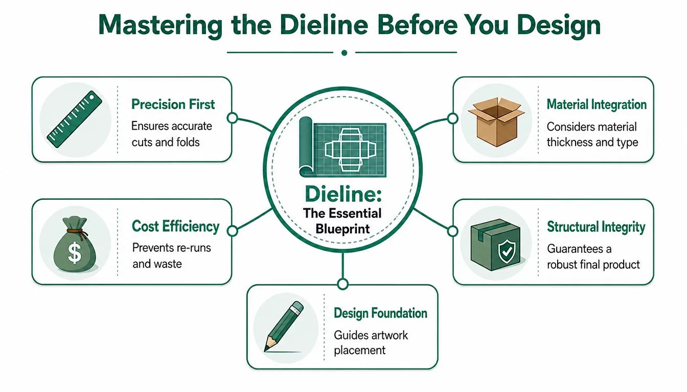
A dieline is the flat template for the pack. It shows where the material will be cut, folded, glued, perforated, or left clear. Without it, artwork placement becomes guesswork.
The dieline is the build plan
The simplest way to think about a dieline is as an architectural drawing for packaging. It isn't the finished object. It's the exact map that tells the printer and cutter where every panel begins and ends. If the file doesn't match the supplied template, the design may drift onto a fold, disappear into a glue flap, or land upside down on the closing panel.
This is why the dieline should always come from the packaging supplier producing the job. A generic template pulled from old artwork or another printer's file can be close in appearance and still be wrong in production. Board thickness, closure style, and manufacturing tolerances all affect where artwork should sit.
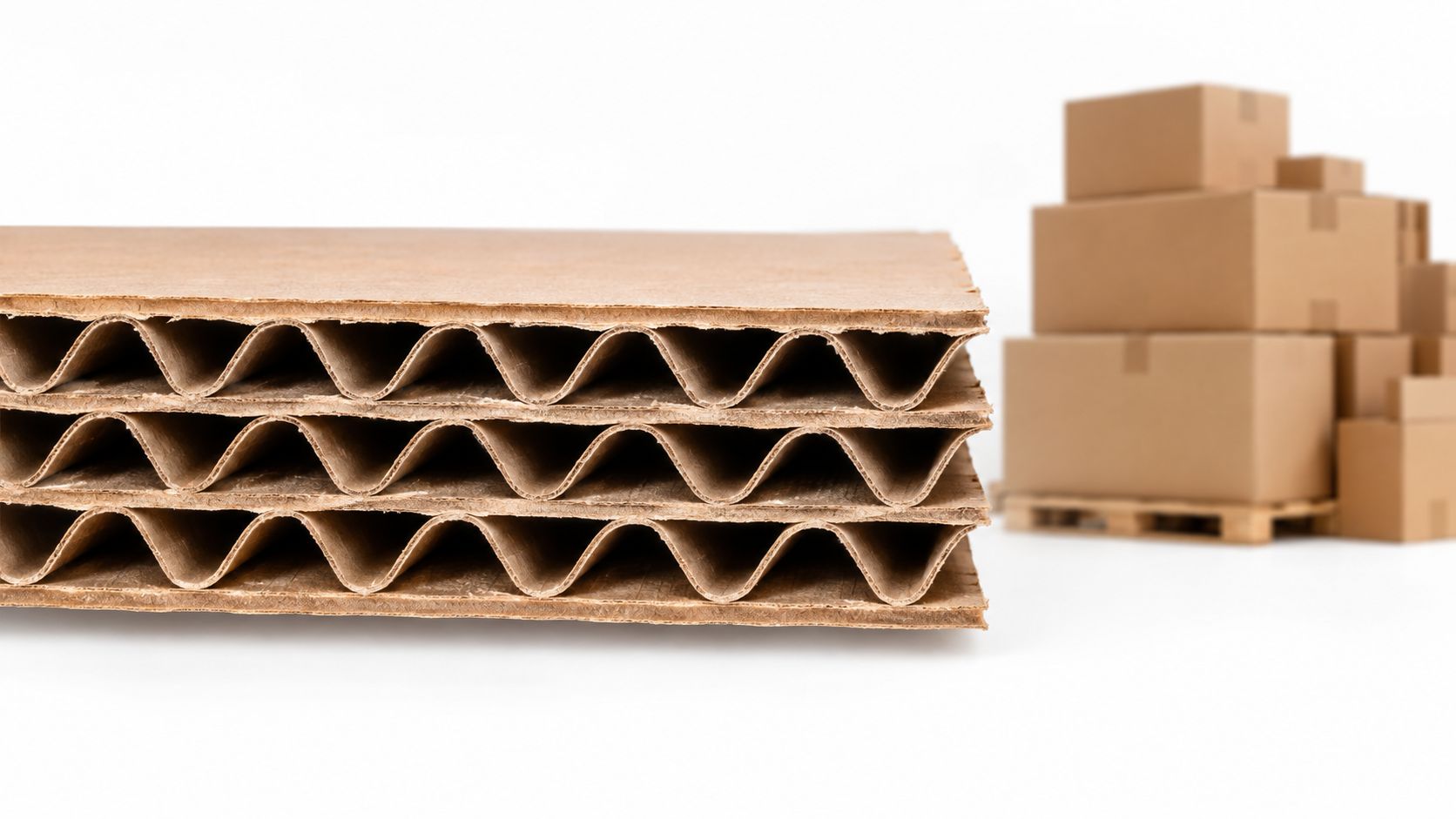
For brands ordering Cardboard Boxes, the structural choice matters before design starts. The category covers single wall, double wall, mailing and storage formats, so the outside shape may look simple while the panel layout varies significantly from one box style to another.
What to check before artwork starts
Before any logo or background graphic is placed, four checks save a lot of trouble later.
-
Confirm the orientation
Ask which panel is considered the front, where the opening flap sits, and how the customer first sees the pack. This sounds basic, but it prevents upside-down branding on lids and side panels.
-
Identify non-print areas
Glue tabs, lock flaps, internal folds, and dust flaps often shouldn't carry critical design elements. Some can print, but they don't always display cleanly in the assembled pack.
-
Read the line colours
Most dielines separate cut lines, crease lines, and perforations by colour or layer. Those guides are for production, not for the finished print file, so they need to stay organised and clearly separated.
-
Visualise the 3D pack
A flat file can mislead people into centring everything mechanically. Real packs are handled in three dimensions. A logo that looks centred on the spread may sit too low once the lid folds over.
A good packaging layout isn't just balanced on-screen. It's balanced when the box is folded, taped, stacked, and opened.
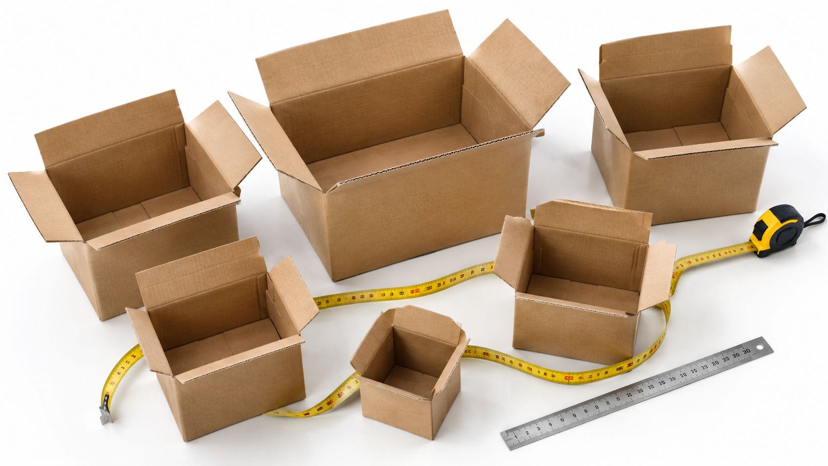
Another practical point is measurement. If the ordered size is unclear, artwork gets built around assumptions and then has to be reworked. A supplier guide on how to measure boxes helps clarify internal dimensions, panel sequence, and the difference between what looks right in a mock-up and what fits the physical pack.
The brands that handle dielines well usually do one thing early. They treat the template as fixed and build the design around it. The brands that struggle often do the reverse. They finish a visual concept first, then try to force it onto a structure that was never considered properly.
Core Technical Specs for Flawless Printing
A first print run often goes wrong in ordinary ways. A founder approves artwork on a laptop, the boxes arrive a week later, and the brand colour looks flat, the edge shows a thin white line, or the front-panel text sits too close to the trim. None of those errors feel dramatic while the file is being built. They become expensive once the job is on press.
Resolution that survives print
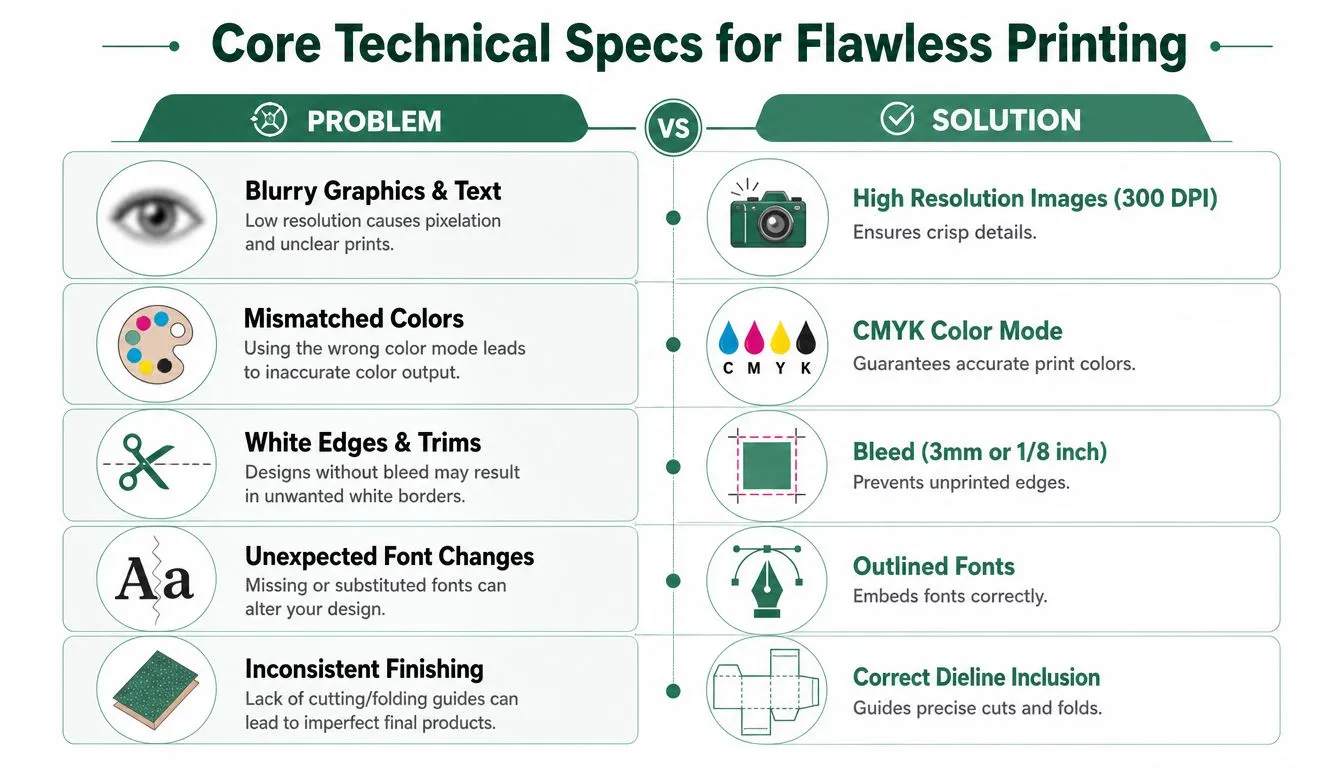
The standard starting point is 300 DPI at final print size. The key phrase is “at final print size”. A product image that looks fine in a Shopify banner can fall apart when it is enlarged to fill a postal box lid.
Adobe's print design guidance explains why effective resolution matters in press output. Low-resolution assets lose detail, soften at the edges, and expose compression artefacts that a screen can hide. See Adobe's overview of image resolution for print.
For a small UK e-commerce brand, this is a budget issue as much as a design issue. If hero photography prints soft, the pack looks lower value. If the logo has been pulled from a website PNG, the supplier may stop the file for correction, or worse, print exactly what they were sent and leave you with stock that does not represent the brand properly.
Low-resolution problems usually show up in three places:
- Photography loses texture. Food, fabric, and skincare shots flatten first.
- Small text inside images becomes hard to read. This is common with ingredient callouts and promotional badges.
- Logos look uncertain at the edges. That gives the whole pack a cheaper feel.
Workshop note: If a logo only exists as a JPEG or PNG, fix that before approving print. Brand marks and type should usually remain vector-based.
The same production rule shows up in other printed products. Musicians ordering stage graphics face similar file-prep problems, which is why this guide for drummers on custom heads is a useful parallel. Different product, same lesson. Build the artwork for the print method, not for the screen preview.
Bleed and safe area protect the job
Printers and finishers work to tolerances. Cartons are cut, folded, and glued by machinery, so the artwork needs room for slight movement during production. That is the purpose of bleed and safe area.
A practical baseline for carton work is 3mm bleed outside the trim and a 5mm safe zone inside it. The British Printing Industries Federation's artwork guidance uses the same principle. Extend backgrounds beyond the cut edge, and keep live content well clear of trim and folds. See BPIF guidance on preparing artwork for print.
Here is the commercial impact:
| Element | What it does | Business impact if ignored |
|---|---|---|
| 3mm bleed | Carries colour or imagery past the cut line | White slivers on edges can make a new print run look like seconds |
| 5mm safe zone | Keeps logos, text, and claims away from trim | Cropped copy, crowded panels, and packs that feel poorly made |
This catches first-time buyers out because the file can still look neat on screen. The problem appears after trimming. I have seen perfectly good artwork ruined by a front-panel title that sat 2mm too low. The print was usable, but not sellable at full confidence.
File formats that printers can use
File format determines how much control the printer has. Vector artwork stays sharp at any size, which makes it the right choice for logos, icons, linework, and most typography. Raster images are fine for photography, provided they meet the resolution requirement at output size.
The safest setup is usually simple:
- Keep logos and type as vectors. AI, EPS, and press-ready PDF files are standard.
- Use raster files for photos and texture only. Check the effective DPI after scaling.
- Supply a print-ready PDF for approval and production. That reduces font issues, missing links, and layer confusion.
Brands ordering custom printed cardboard boxes for e-commerce shipments often focus on finishes, board strength, and the unboxing experience first. Those choices matter. The file spec is what decides whether the finished pack looks clean enough to justify the spend.
One final trade-off is speed versus correction cost. Sending an editable file with live fonts and loosely linked images may feel faster today. Sending a locked, press-ready PDF usually saves time once pre-press starts, because the supplier is checking a production file instead of rebuilding your artwork under deadline.
Managing Colour for Predictable Brand Consistency
Colour problems cause more disappointment than almost any other packaging issue because they feel personal. A brand has spent time choosing a signature green, a warm neutral, or a dense black, then the first printed sample arrives and it looks flatter, dirtier, or unfamiliar.
Why screen colour keeps disappointing in print
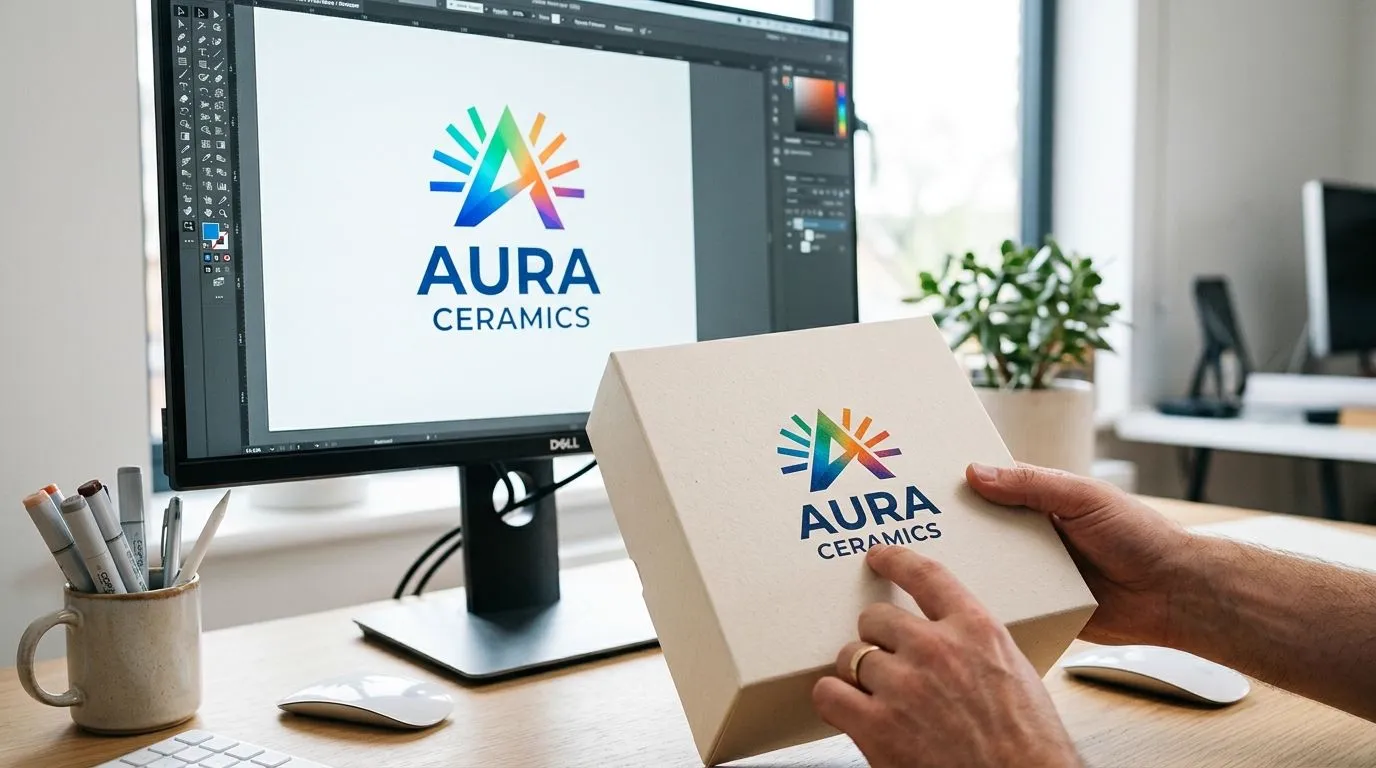
The usual cause is a mismatch between RGB and CMYK thinking. Screens display light. Print uses ink. A colour that glows on a monitor can dull down once it's converted for cardboard or paper stock.
That's why artwork for print should be designed in CMYK from the start, not converted at the end as an afterthought. Late conversion often shifts the look of key brand colours and changes contrast relationships inside the design. Soft pinks, bright blues, and vivid greens are common casualties.
A useful discipline for small brands is to stop treating the laptop screen as the final judge. The screen is only a preview. The physical substrate, ink behaviour, and finish all influence the result. Matte board, kraft-toned stock, and coated white board will each carry colour differently.
One operational fix helps here. Keep brand assets organised in one place with clear file naming, approved logo versions, and colour references. Teams that handle packaging, web, social, and print from separate folders often introduce version drift without noticing it. A practical primer on marketing digital asset management is worth reading if a business has multiple people touching the same artwork files.
When PMS is worth the extra control
For some projects, CMYK is enough. For others, it isn't. If a brand colour has to match tightly across packaging, labels, inserts, and other printed materials, PMS or spot colours can offer more predictable control.
The trade-off is straightforward:
- CMYK suits many standard jobs. It's practical for artwork with photography, gradients, or multicolour layouts.
- PMS suits stricter brand matching. It's useful when a specific hue matters more than broad flexibility.
- Budget changes with the choice. More exact colour control can add complexity to the print setup, so it's worth reserving for places where customers will notice the difference.
One small refinement is worth noting with black. A plain 100% black can print a little flat on some packaging surfaces. For solid black panels, many designers use a richer black build to create more depth. That needs to be handled carefully with the printer, because too much ink coverage can create its own production problems. The point isn't to make every black area heavier. It's to decide where a premium-looking black is worth the added attention.
Colour consistency doesn't come from hope. It comes from choosing the print method that matches the brand priority.
Finalising Artwork With Pre-Flight Checks
The last stage before approval is where disciplined brands save money. By this point the design is usually settled, which creates a false sense that the hard work is done. In reality, final checks are where many preventable production errors are either caught or approved by accident.
The checks that prevent expensive mistakes
For many UK businesses, professional bespoke packaging artwork can cost from £200 for a simple label to over £5,000 for complex branding, and custom printed runs in the UK typically start from 500 units, according to Buddy Packaging's guide to packaging design costs in the UK. That changes how final checks should be treated. A typo on a draft is irritating. The same typo across a minimum print run becomes an avoidable stock problem.
A reliable pre-flight check usually includes the following:
- Fonts outlined: Convert text to outlines so the printer's system doesn't substitute a missing font and alter the layout.
- Linked assets checked: Missing links can swap crisp artwork for low-quality previews or blank boxes.
- Special finishes separated: Foil, emboss, deboss, and spot UV usually need their own clearly named layers.
- Dieline kept non-printing: The cutter guide should stay visible for setup but not output as artwork.
- Spelling reviewed by more than one person: Brand names, URLs, ingredients, and contact details deserve a slow read.
Special finishes deserve extra care because they often look simple in a mock-up but require precise file handling. If a logo is getting foil, the foil area must usually be isolated cleanly. If spot UV is being added, the varnish layer needs to match the intended area exactly. Overlaps and accidental offsets are easy to miss in a busy file.
Sometimes a visual reference helps a team spot what “full colour” really means in production terms. A straightforward example of vibrant custom sticker designs can be useful when discussing solid fills, contrast, and edge definition before signing off packaging artwork.
Proofs are the last cheap correction
The proof stage isn't a courtesy. It's the final decision point before physical production starts. Every line of text, every panel order, every barcode placement, every fold relationship should be checked as if the printed stock already exists and can't be changed. Because once approved, that's effectively the situation.
A disciplined proof review often works better when done in passes rather than one fast read:
- Check structure first. Front, back, sides, flaps, and opening orientation.
- Check brand assets next. Logo size, colour treatment, and spacing.
- Check copy separately. Spelling, grammar, legal text, product names.
- Check production details last. Layers, finishes, trim positions, and exports.
Packaging Panda is one UK supplier that offers bespoke packaging across boxes, mailers, bags, and tubes with minimum runs from 500 units, which makes this proofing discipline especially relevant when a business is moving from concept to an actual production quantity.
The practical mindset is simple. Approval should only happen when the file is being judged as a manufacturing instruction, not just a design visual.
Sustainable Artwork for a Greener Unboxing
Sustainable packaging decisions often start with material choice, but artwork preparation matters just as much. The cleanest print run is the one that doesn't need correcting, replacing, or writing off because of preventable file errors. Reprints consume board, ink, time, and transport. Good artwork reduces waste before the press even starts.
That puts technical discipline in a different light. A correct dieline, controlled colour setup, clear safe zones, and a careful proof review aren't just production habits. They're part of a more responsible packaging process. Brands that want a greener unboxing experience should look at the whole chain, including whether the artwork supports recyclable materials, restrained coverage, and print choices suited to the substrate.
A few practical choices help:
- Design for recyclability: Keep structural choices and print coverage aligned with the material's end use.
- Match artwork to eco-focused materials: If the pack uses recyclable paperboard or soy-based inks, the design should work with those characteristics rather than fight them.
- Avoid unnecessary complexity: Fewer avoidable finishes and cleaner file setup usually make production easier to control.
Bespoke packaging artwork works best when branding, print accuracy, and sustainability are treated as the same conversation. That's where a supplier becomes more than a box source. The business needs somebody who can provide the structure, the print route, and the practical constraints early enough to avoid wasteful decisions later.
For businesses planning a first custom print job or refining an existing pack, Packaging Panda provides UK packaging supply across standard and bespoke formats, including sustainable options, mailing products, protective packaging, and made-to-order branded solutions. A careful conversation about box style, artwork setup, and production requirements before sign-off usually saves more time and cost than fixing mistakes after the order is placed.