Personalised Cardboard Gift Boxes: A UK Business Guide
A small business owner usually notices the packaging problem at the same point. The product is good, repeat orders are starting to come in, and customers like what they've bought. Then the parcels go out in plain stock boxes, and the delivery experience feels flatter than the brand does on Instagram, Etsy, Not On The High Street, or the shop counter.
Explore our personalised gift boxes →
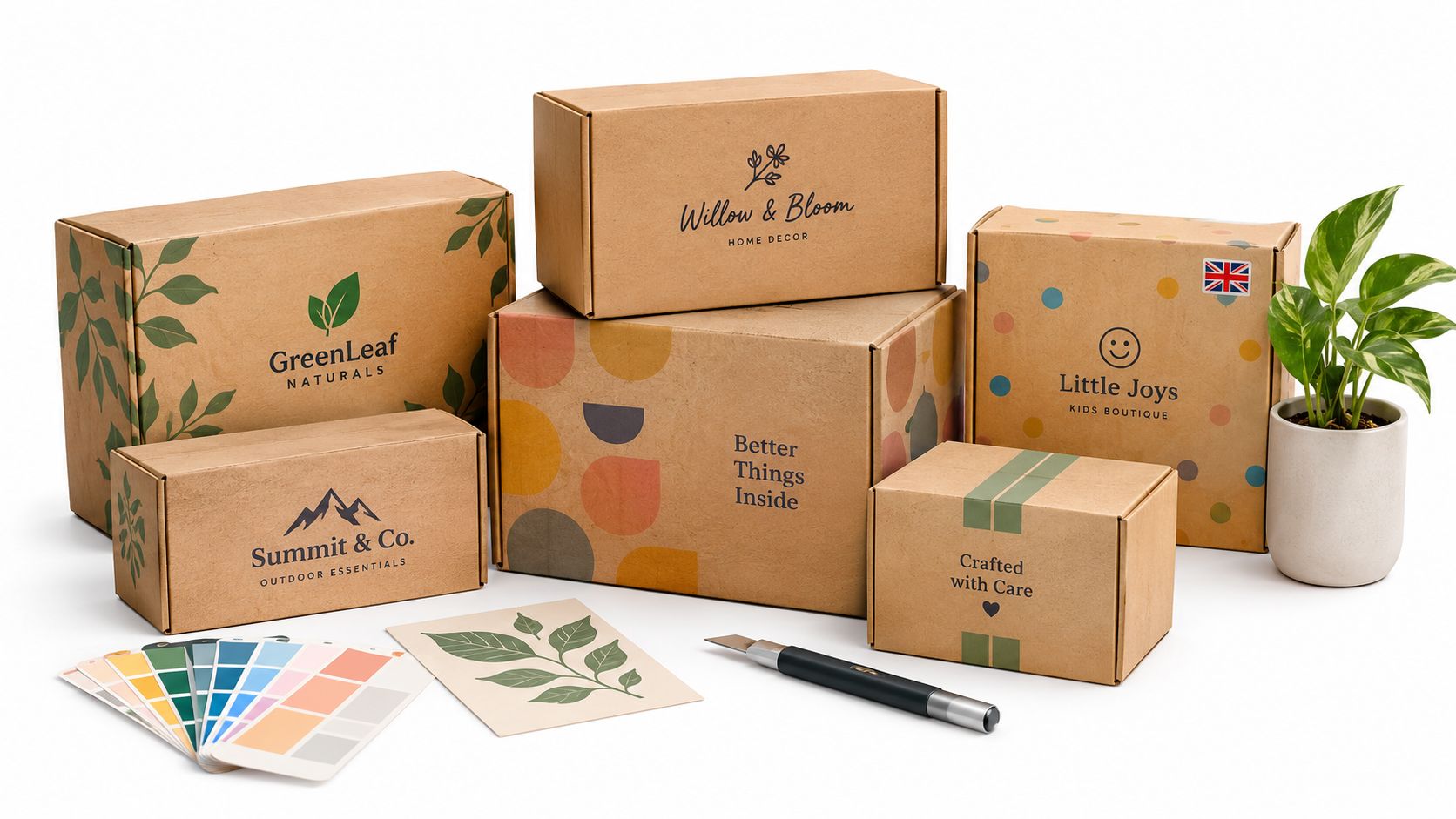
That gap matters more than many brands expect. A personalised cardboard gift box isn't just a container. It carries the product safely, signals quality before the item is touched, and sets expectations about whether the brand feels thoughtful, premium, sustainable, or forgettable. The tricky part is that custom packaging often looks more complicated than it really is, especially when a business is trying to balance cost, courier damage, and eco requirements at the same time.
For UK sellers, that balancing act is where most poor decisions happen. Many guides talk about printing and colours. Far fewer deal properly with what happens when a lightweight eco board goes through a courier network and arrives scuffed, crushed, or split at the corners.
Table of Contents
- Why Generic Boxes Are Costing Your Brand
- Choosing the Right Board and Structure
- Branding Your Box with Print and Finishes
- Preparing Your Artwork and Approving Proofs
- Navigating Costs, MOQs, and Lead Times
- Integrating Boxes into Your Fulfilment Operations
- Your Next Steps to Perfect Personalised Packaging
Why Generic Boxes Are Costing Your Brand
Plain boxes look cheap even when the product isn't. That's the core issue. A customer can forgive simple packaging when buying a low-cost spare part, but they judge it differently when they've ordered a gift set, handmade candle, bakery item, or premium knitwear.
Generic packaging also creates a margin problem. If a business is trying to charge a premium, the box has to support that price point. If it doesn't, the product has to do all the work on its own. That's harder online, where the first physical contact with the brand often happens at the doorstep.
A branded gift box does two jobs at once. It protects the product and it justifies the purchase.
This matters most for direct-to-consumer brands that rely on repeat business and referrals. The packaging doesn't need to be extravagant, but it should feel deliberate. Businesses that already optimise D2C sales with personalisation on-site usually find that the parcel itself should continue that same personalised experience, rather than dropping back to a plain stock carton.
The first decision isn't print. It's structure. If the board, style, and closure are wrong, the nicest artwork in the world won't rescue the customer experience.
Choosing the Right Board and Structure
A customer opens the parcel and the print looks good, but one corner has crushed, the lid has bowed, or the base has softened under the product weight. That failure usually starts with board and structure, not branding.
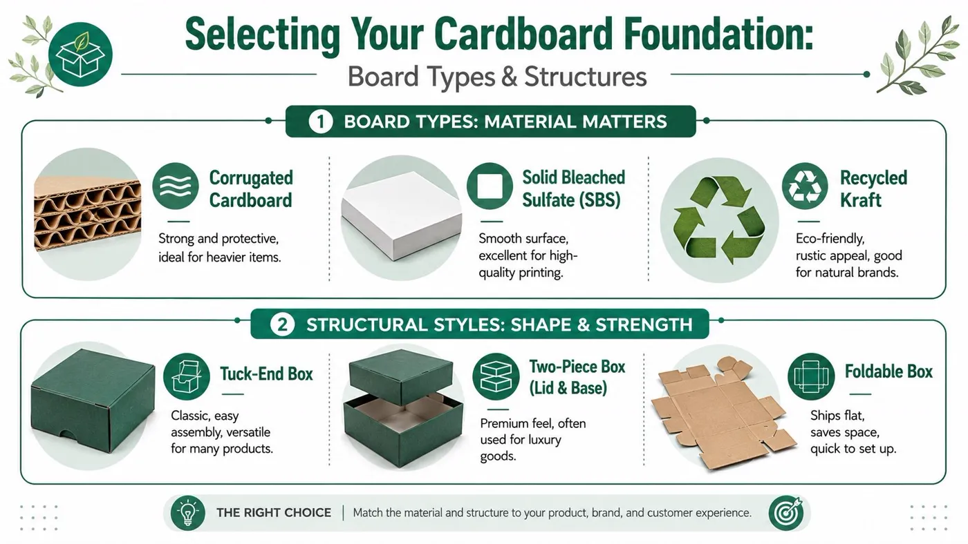
Start with the product, not the logo
The right spec depends on what the box has to carry, how tightly the item fits, and what happens between packing bench and doorstep. A glass candle puts pressure into a small area and punishes weak corners. A folded jumper is much lighter and usually needs far less board strength.
That is why structure comes before artwork.
Three checks sort out the first decision fast:
- Where is the weight concentrated: Heavy products in a small footprint need better base strength and corner support.
- What happens if the item moves: Movement turns presentation packaging into transit risk.
- Will the parcel go through a standard courier network: Repeated handling, stacking and drops change what counts as “strong enough”.
For standard shipping cartons and transit-led formats, many businesses start by comparing cardboard boxes for outer transit use before specifying the presentation box inside. That approach usually cuts damage risk without forcing the gift box itself to do every job.
Where sustainability and courier durability clash
This is the trade-off many guides gloss over. A board can be recycled, recyclable, and look right for an eco-focused brand, but still be the wrong choice for UK parcel handling if the grade is too light or the structure has too much unsupported span.
In practice, thinner recycled board often works well for light products, local collection, shelf-ready retail, or hand-delivered orders. It becomes a weak choice when the pack is carrying glass, ceramics, jars, bottles, or mixed hamper items through a courier route.
The Sustainable Packaging Coalition explains that sustainable packaging decisions should consider product protection as well as material impacts, because damage and replacement can wipe out the benefit of using less material in the first place, as outlined in its guidance on sustainable packaging design considerations.
That is the commercial reality. A box that fails in transit is not the greener option once returns, replacements, resends, and wasted product are counted.
A stronger recycled board with good creasing and a tighter-fitting structure often beats a lighter kraft specification chosen mainly for appearance. Kraft can still be the right call. It just needs enough substance behind it.
Practical rule: Choose board by route risk first, then by finish and sustainability credentials.
A simple selection framework
The easiest way to choose is to match the board and style to the failure risk.
| Product type | Better starting point | What often goes wrong |
|---|---|---|
| Glass candles | Higher-rigidity board, close fit, insert if needed, separate transit outer | Thin gift box with open voids and weak corners |
| Bakery gifts | Food-safe presentation format, stable base, secure closure | Decorative format that marks easily or shifts in transit |
| Knitwear or scarves | Folding carton or lighter gift format | Over-specifying the board and adding avoidable cost |
| Hampers and mixed sets | Rigid lid-and-base or reinforced folding structure | Single-wall format that bows under uneven weight |
Small businesses usually get better results by asking four direct questions before requesting a quote:
- Is the box mainly for presentation, protection, or both?
- Will it travel alone, or inside a shipping carton?
- Does the product need an insert, or just a tighter internal fit?
- What matters more on this range: premium feel, lower unit cost, or lower material weight?
Those trade-offs affect spend straight away. Heavier board improves compression strength, but increases unit cost and shipping weight. Inserts improve protection, but add packing time. A rigid box feels premium, but a fold-flat format often makes more sense for brands short on storage space or ordering in smaller batches.
According to DataIntelo's customised gift boxes market report, demand for customised gift boxes is growing with e-commerce and branded unboxing. That growth does not make weak specifications any less expensive. If the box has to survive UK courier handling, the safer decision is often a well-structured recycled board with a transit plan behind it, rather than the lightest material that still looks acceptable in a sample.
Branding Your Box with Print and Finishes
A box can survive the courier network and still let the brand down the moment it is opened. I see this regularly with small ecommerce ranges. The structure is sound, but the print looks flat, the finish scuffs too easily, or the style says “premium” while the material says “budget”.
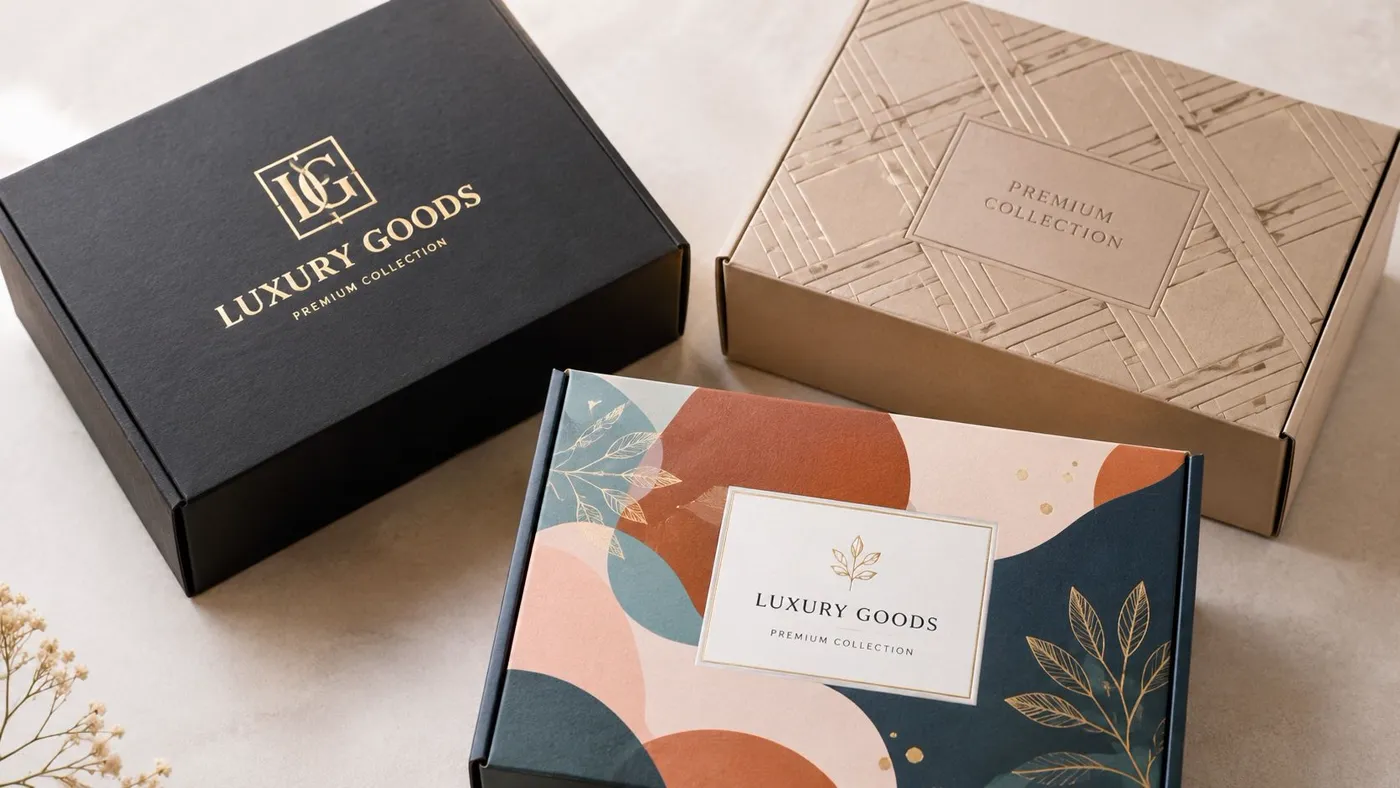
Branding decisions work best when they reflect how the box will be used. A presentation box handed over in person can carry more delicate finishes. A gift box going through UK parcel networks needs print and surface choices that still look good after conveyor belts, van loading, and doorstep delivery. Sustainable materials add another trade-off. Uncoated recycled boards can look honest and premium in the right design, but they usually mark more easily than laminated surfaces.
Match the print method to the commercial job
The right print method depends on quantity, artwork detail, colour expectations, and how settled the design is.
Digital print suits shorter runs and frequent artwork changes. It is often the sensible route for limited editions, test launches, and growing brands that do not want to commit to large stock holdings too early. The unit price can be higher, but the lower setup cost reduces risk.
Lithographic print gives better control over fine detail, solid colour consistency, and premium presentation. It usually makes financial sense once volumes rise and the artwork is stable. If a brand needs refined typography, subtle tonal work, or a cleaner luxury finish, litho is often worth the added setup.
Flexographic print fits simpler branding and more transit-led formats. It is practical for outer gift packs, subscription formats, or ranges where cost control matters more than photographic detail.
Smithers' analysis of the packaging printing market shows digital print continuing to grow because brands want shorter runs, versioning, and faster changeovers in packaging production, which is highly relevant for small businesses testing personalised formats in ecommerce Smithers' packaging printing market analysis. That does not make digital the automatic choice. If the box is meant to carry a luxury retail feel at scale, litho still earns its place.
Two mistakes come up repeatedly:
- Too much print specification for the job. A simple logo box ends up on an expensive print route that adds cost without raising perceived value.
- Too little print specification for the brand. Fine serif type, pale brand colours, or dense artwork are pushed onto a method that cannot reproduce them cleanly.
Finishes affect durability as much as appearance
Finishes change how a customer reads the box, but they also change how the box performs in packing and delivery.
A matt laminate gives a cleaner, restrained look and can help protect printed surfaces, although dark matt finishes can still show scratches and rub. Gloss laminate increases colour punch and usually resists light marking better, but it can look too loud for natural or handmade brands. Embossing and debossing add value without relying on heavy ink coverage, which is useful if a business wants a premium feel while keeping the graphic style simple.
For environmentally focused brands, the finish needs more discipline. Heavy lamination, foil, and multiple special processes can weaken the sustainability story, even if the board itself is recycled. In some cases, a well-printed uncoated board with a debossed logo gives a better result commercially and visually than a more expensive finish stack.
I usually advise clients at Packaging Panda to ask one practical question before approving any finish. Will this still look right after picking, packing, and courier handling?
That question changes decisions quickly.
Soft-touch coatings can feel expensive, but they are not always the best option for high-contact fulfilment. Large dark ink areas can look smart in a flat proof, then show every rub line in transit. Foil can be effective in small areas, but too much of it starts to fight with the rest of the design and pushes cost up. One finish, chosen well, nearly always works harder than several added out of habit.
A few combinations tend to hold up well in practice:
- Natural skincare, candles, artisanal food: recycled or kraft-look board, limited colour palette, clean digital or litho print, subtle deboss
- Luxury gifting, cosmetics, PR kits: smooth white-lined board, high-detail print, matt laminate, selective emboss or foil
- Broad ecommerce gift ranges: simple repeatable branding, scuff-resistant finish, easy-to-pack format, restrained inside print if the margin supports it
If the logo file is weak, fix that before spending money on premium print. MyImageUpscaler's logo upscaling can help improve an old asset as a starting point, but production artwork still needs to be rebuilt properly for print if the brand wants sharp results.
The best branded box is not the one with the most decoration. It is the one that fits the product, survives the delivery route, and looks worth the price paid.
Preparing Your Artwork and Approving Proofs
A box can be structurally sound, printed on the right board, and still fail at approval stage because the artwork file was built for a screen rather than a press. I see this regularly with small brands ordering their first personalised cardboard gift boxes. The design looks sharp in Canva or Adobe Illustrator, then shifts on fold lines, prints darker than expected, or puts a barcode across a glue area.
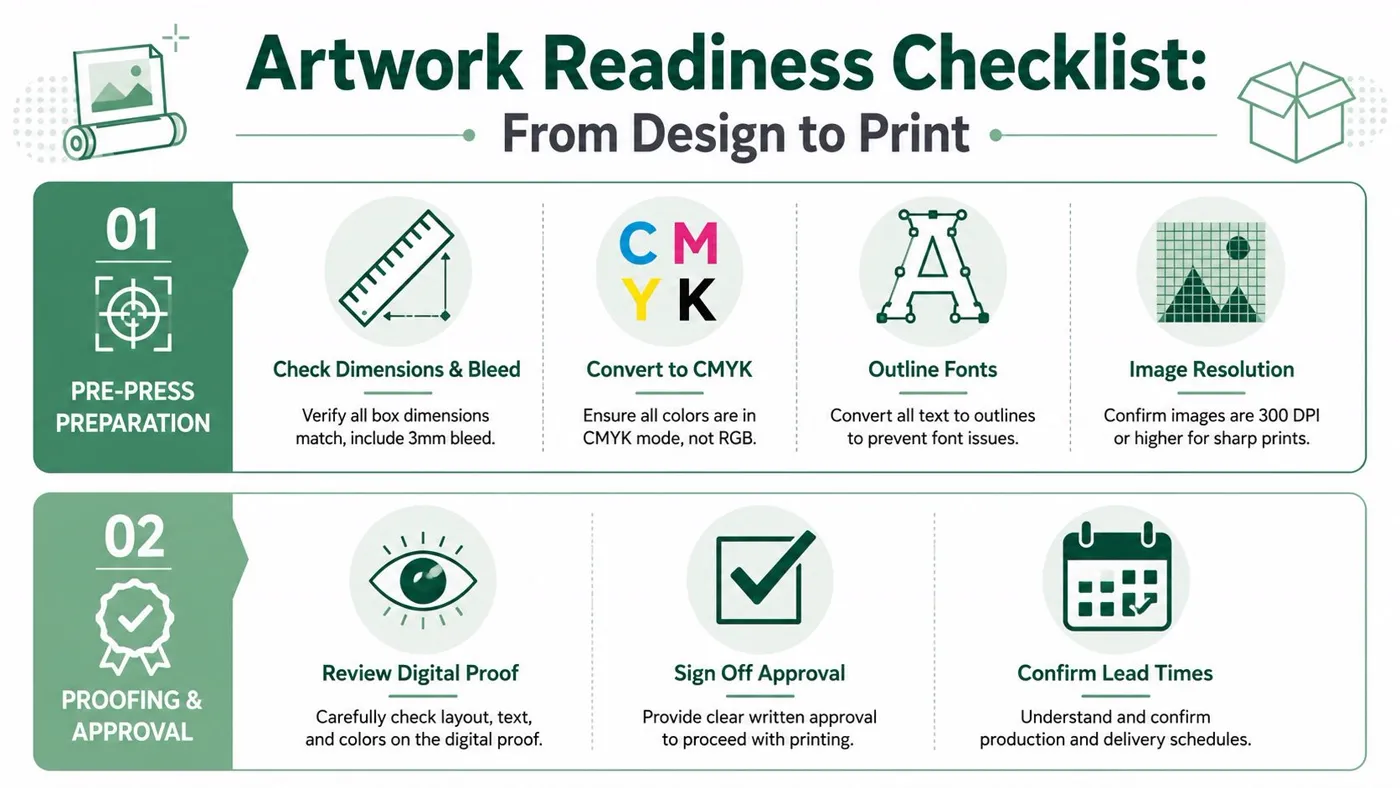
Artwork prep is where commercial decisions show up. A recycled board can be the right sustainability choice, but it often has more surface variation than a bright white lined board, so very fine detail and pale colours need more care. A mailer going through UK courier networks also needs graphics positioned with folding stress, corner knocks, and rub points in mind. Good artwork does not just look on-brand. It survives production and transit without creating complaints or reprints.
The file checks that prevent avoidable delays
Suppliers need print-ready files, not just attractive layouts. Before approval, check these points against the final dieline.
- Dimensions and bleed: Artwork needs to match the cutter guide exactly, with bleed extending past trim so colour reaches the edge cleanly.
- Colour setup: Build files in CMYK. RGB artwork often shifts once it reaches press, especially with bright blues, greens, and pinks.
- Logo format: Use vector files where possible. They stay sharp across lid panels, belly bands, and small side panel branding.
- Fonts: Outline text or supply the font files correctly so nothing reflows at pre-press.
- Image resolution: Low-resolution product shots soften quickly on pack, especially if they are enlarged.
- Quiet zones: Keep key text, QR codes, and barcodes away from creases, tuck flaps, and glued seams.
If the brand only has an old low-resolution asset, MyImageUpscaler's logo upscaling can help as a starting point. It is still worth rebuilding the final mark properly for print if the box needs clean edges and consistent reproduction.
For early test runs, it can make sense to use a simpler one-colour layout while the structure and sizing are still being proven. That approach keeps artwork revisions cheaper and faster, especially on custom printed boxes with no minimum order quantities where brands are testing before committing to a larger run.
What a proof should actually confirm
A proof is the final production check. It needs to answer two questions. Is the file correct, and is it correct on this box style and board?
The second part gets missed. Artwork approved on a flat PDF can still create problems once folded. That matters more on gift boxes with inside print, shoulder boxes, mailer wraps, or any format where presentation has to hold up after courier handling.
A disciplined proof review should cover:
-
Panel hierarchy
Check which panel becomes the front in real use. Lid-top branding, side messaging, and unboxing copy can all read differently once assembled. -
Fold and seam interference
Keep important copy away from glue flaps, tuck points, and board bends where cracking or distortion can affect readability. -
Text size and contrast
Small pale text often drops away on kraft or recycled substrates. If sustainability is a priority, increase contrast and simplify fine detail. -
Barcode placement
Make sure scanners can read it on a flat accessible panel, not across a corner or close to a closure point. -
Print-to-structure fit
Confirm the artwork still works if the board grade changes. A stronger board for courier durability can slightly affect creases, folds, and visible panel depth. -
Finish mapping
Foil, emboss, spot varnish, and lamination need their own clearly marked areas. Ambiguity here leads to expensive corrections.
Smithers notes in its packaging market analysis that ecommerce growth continues to increase demand for transit-ready pack formats, which puts more pressure on artwork and structure to work together rather than as separate decisions. That is the practical trade-off. A more sustainable substrate may be the right choice, but if the design relies on delicate detail that scuffs or loses contrast in delivery, the brand ends up paying twice.
Treat proof approval like product sign-off. Once it goes to print, the error becomes stock.
A physical sample is worth the extra step for premium gifting, tight product tolerances, or any box expected to travel through parcel networks without an outer pack. Digital proofs are often enough for straightforward cartons, but only if someone checks them with fresh eyes and with the assembled box in mind, not just the flat artwork file.
Navigating Costs, MOQs, and Lead Times
The cheapest box on paper often becomes the most expensive box in practice. It causes packing delays, damage claims, or a redesign after the first order. Most packaging overspend comes from poor planning rather than from choosing custom packaging itself.
What actually drives the cost
Several factors shape price at once. Size matters because larger formats use more material and take up more pallet and storage space. Print complexity matters because one-colour branding is simpler to produce than artwork with broad coverage and multiple finishing passes. Bespoke cutters add setup cost. Special finishes add labour and process steps.
Minimum order quantities exist because custom work has fixed setup stages. A supplier still has to prepare tooling, files, materials and machine time whether a business orders a small run or a large one. That's why personalised cardboard gift boxes usually become more economical once a brand settles its dimensions and repeat design.
For some businesses that need flexibility before moving into a larger bespoke run, this guide to custom printed boxes no minimum in the UK is useful for understanding where low-commitment ordering fits and where it doesn't.
Example unit cost vs order volume
The exact figures depend on spec, but the pattern is consistent. Larger runs usually reduce the unit cost because setup is spread across more boxes.
| Order Quantity | Example Price Per Box | Total Cost |
|---|---|---|
| Lower volume trial run | Higher per-box cost | Lower total commitment |
| Mid-volume repeat order | Lower per-box cost | Higher overall outlay |
| Larger planned production run | Lowest per-box cost | Highest upfront spend |
That trade-off catches many smaller brands. They focus on the invoice total and ignore the unit economics. A slightly larger order can be the better commercial decision if the design is stable, the storage space exists, and the packaging won't date quickly.
How to spend smarter
The strongest savings usually come from simplification, not cutting quality blindly.
Consider these decisions in order:
- Use a standard size where possible: A standard cutter often avoids bespoke tooling charges and reduces lead time risk.
- Reduce print complexity before reducing board strength: A simpler artwork route is usually less damaging than weakening the structure.
- Plan reorders early: Rush production and fragmented ordering often cost more than a well-timed larger run.
- Keep the design system reusable: Seasonal sleeves, stickers, or inserts can refresh a stable box format without forcing a full redesign.
- Separate presentation from transit when needed: A smart outer shipper can protect a nicer inner gift box more efficiently than overbuilding the presentation box itself.
Commercial check: If a brand is paying for premium print on boxes that arrive dented, the money has been spent in the wrong place.
Lead times also need realistic thinking. Custom packaging takes longer than pulling stock cartons off a shelf, especially when proofs, finishes and shipping windows are involved. Businesses that tie packaging decisions to launch dates at the last minute usually end up choosing between rush costs and compromised specification. Neither is a good option.
A better habit is to tie packaging review to sales forecasting. If Christmas gifting, Mother's Day, wedding season or a product launch is predictable, the packaging order should be planned around that cycle rather than around the point when existing stock runs out.
Integrating Boxes into Your Fulfilment Operations
A good-looking box can still be a poor operational choice. If it packs slowly, wastes void fill, misses parcel thresholds, or takes over the stock room, it steadily erodes margin.
Packing speed matters
Some box styles are faster to assemble than others. That difference matters when a small team is packing orders during peak periods. A foldable format that stores flat and pops into shape quickly can save time every day, even if the individual saving seems minor.
Product fit matters just as much. If staff have to improvise tissue, paper, tape and extra inserts to stop products moving, the packaging spec wasn't finished when it was approved. The labour cost then shifts into fulfilment.
A practical review should ask:
- Does the box fit the product without excessive void fill
- Can a packer build it quickly with minimal training
- Does the packed size sit sensibly within carrier limits
- Will the outer surface stay presentable through handling
Storage, measurement and dispatch discipline
Flat-packed cartons help smaller businesses because they reduce storage pressure and make stock control easier. Fully assembled premium styles can look attractive in samples, but they occupy space quickly and need more careful handling before use.
Correct measurement is another routine problem. Length, width and depth need to be checked consistently, particularly when a business is trying to protect a parcel band or standardise shelf locations. This guide on how to measure boxes is useful for keeping internal measurements consistent across buying, storage and dispatch.
The operational aim is simple. The personalised box should support the brand without slowing the warehouse down. When structure, storage, packing speed and carrier fit are considered together, the packaging becomes easier to scale.
Your Next Steps to Perfect Personalised Packaging
The strongest personalised cardboard gift boxes follow three rules.
Material first. If the board and structure don't match the product and courier route, the branding won't matter when the parcel arrives damaged.
Brand second. Print and finishing should reinforce what the business already is. They shouldn't try to imitate a luxury signal that the product or audience doesn't support.
Logistics always. The right box has to work in storage, at the packing bench, and in the delivery network. If it only works in a mock-up, it isn't ready.
Small brands don't need to solve everything at once. A sensible first move is usually one stable box format, one clear branding approach, and one packing method that staff can repeat without friction. From there, the packaging can evolve as volumes grow and the product range becomes clearer.
For brands refining how products look before they ever reach the box, PhotoMaxi's AI image guide is a practical resource for improving product presentation assets used in listings, launch pages and packaging planning.
If a business is ready to move from plain stock packaging to a more considered setup, Packaging Panda supplies UK packaging for ecommerce, retail and fulfilment, including sustainable options and made-to-order solutions. A useful starting point is to lock in the product dimensions, expected shipping method, and branding priorities before requesting samples or pricing.