Tissue Paper Colours for UK Packaging
The popular advice is simple: choose the tissue paper colour that matches the brand and move on. That approach is too narrow for UK packaging. Colour affects perceived value, print and finish, product protection, customer expectations, and the credibility of sustainability claims. A saturated sheet may look striking in an unboxing video yet create awkward questions at the recycling bin, while a muted neutral can support a premium presentation without fighting the rest of the packaging system.
UK buyers also need to separate appearance from end-of-life handling. Local guidance varies, tissue fibres are already short, and dyes or heavy coverage can complicate recovery. The right choice therefore isn't the brightest colour or the cheapest stock in isolation. It's the colour and finish that work across the product, fulfilment process, brand palette, and realistic UK waste route.
Table of Contents
- Why Tissue Paper Colour Matters More Than You Think
- Understanding Tissue Paper Manufacturing and Finishes
- Colour Psychology and the Unboxing Experience
- Stock Colours Versus Custom Dyed Tissue
- Recyclability and Sustainability Considerations
- Practical Use Cases Across UK Business Types
- Ordering Tips and Building Your Colour Strategy
Why Tissue Paper Colour Matters More Than You Think
Coloured tissue is often treated as a decorative extra, but it sits at the centre of the customer's first physical interaction with a parcel. The sheet can be the first branded surface a buyer sees after opening a box or mailer, so it sets an expectation before the product is handled. White and ivory tend to signal cleanliness and restraint, whereas black, navy, or deep green can create a more deliberate premium feel.
The commercial context is substantial. The UK tissue market is about 1.25 million tonnes, with 1.1 million tonnes reportedly produced domestically, while finished tissue imports exceed exports, leaving a net import position of 293 kilotonnes. The UK tissue market context illustrates why most colour decisions happen inside a high-volume, standardised supply chain. Manufacturers need reliable brightness, shade consistency, printability, logistics, and retail acceptance, not an endless collection of niche colours.
Practical rule: Treat tissue paper colours as part of the packaging specification, not as a last-minute styling decision.
The same source notes that BS EN ISO 12625-7:2021 was published on 30 September 2021 to measure brightness and colour in tissue paper under D65/10° daylight conditions. Colour is therefore a measurable quality attribute, not merely a subjective mood-board choice.
Why neutral shades keep winning
British buying behaviour has moved away from coloured toilet tissue. A 2014 report recorded Andrex's coloured-roll share falling from three in ten a decade earlier to one in ten by 2014, an absolute decline of 20 percentage points. The same report said Tesco stocked four coloured products among 61 loo-roll stock-keeping units, approximately 6.6 per cent of the assortment, while Mintel data cited in the report showed bathroom colour matching falling from 20 per cent in 2008 to 7 per cent in 2013. The historical UK reporting on coloured tissue demand provides useful context, although decorative packaging tissue serves a different purpose.
For packaging brands, the lesson isn't that colour has stopped working. It's that white, ivory, kraft-brown, stone, and restrained botanical shades are easier to align with broad customer expectations and sustainability language. Bright or dark colours can still be effective, but they need a clear job.
Understanding Tissue Paper Manufacturing and Finishes
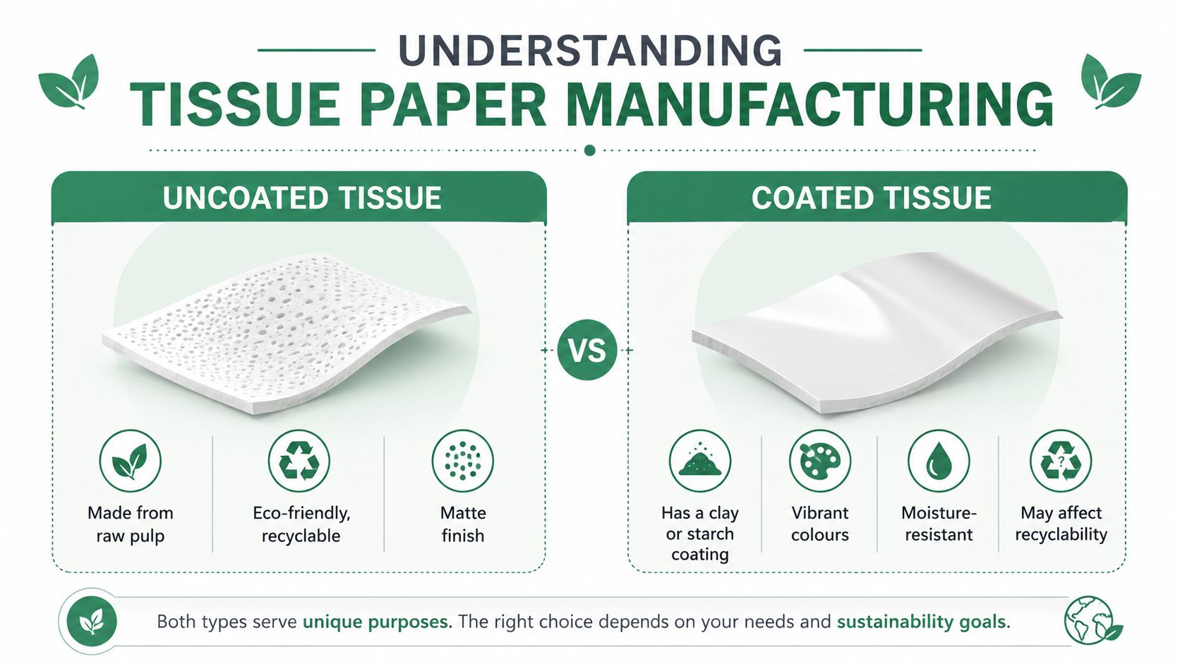
The colour printed or dyed into tissue is only one part of its appearance. The manufacturing route changes how light reflects from the sheet, how transparent it feels, and how a wrapped product appears when the paper is folded or crumpled.
UK packaging buyers commonly encounter acid-free machine-glazed, or MG, tissue and machine-finished, or MF, tissue. MG tissue is pressed against a heated, polished drum, which gives the surface a smoother and shinier appearance. Coloured MG grades are typically specified at about 17gsm, while white and off-white grades are commonly around 14gsm, according to UK tissue paper specifications and finish guidance. MF tissue is also available as acid-free stock around 17gsm and is roller-finished to create a smooth, slightly transparent, crisp hand feel.
MG for visual impact
MG is often the practical choice when the colour needs to look rich and deliberate. The polished surface reflects light, so deep navy, black, forest green, burgundy, and other saturated shades can appear more vivid than they would on a flatter sheet. That finish suits premium fashion, fragrance, jewellery, and gifting, where the paper is part of the reveal rather than simple internal protection.
The drawback is reflectivity. A glossy-looking sheet can make a rustic or deliberately understated brand feel less authentic, particularly when paired with uncoated board and natural fibres. It can also make creases and fingerprints more visible in close-up product photography.
MF for a softer presentation
MF tissue has a less reflective surface and a crisp, slightly transparent feel. It can work well for bakeries, handmade products, ceramics, and brands that want a quiet, tactile presentation rather than a dramatic reveal. Pale blush, sage, cream, soft blue, and natural shades generally benefit from this softer treatment.
The acid-free specification matters for delicate goods. Acid-free tissue reduces the risk of paper-induced surface damage during wrapping and storage, which is relevant for garments, prints, archival products, jewellery, and products with sensitive finishes. Paper Packaging can include paper mailers, honeycomb bags, paper tape, kraft boxes, and tissue, giving businesses a way to consider the sheet alongside the wider paper packaging system.
Colour Psychology and the Unboxing Experience
Colour works before copy. A customer may not consciously name the shade, but the combination of paper, box, label, and product creates an immediate judgement about care, price, and relevance.
White and ivory communicate cleanliness, order, and simplicity. They suit skincare, homeware, stationery, and brands that want the product to remain the focus. Ivory is usually warmer and less clinical than bright white, particularly alongside kraft board or natural-toned labels.
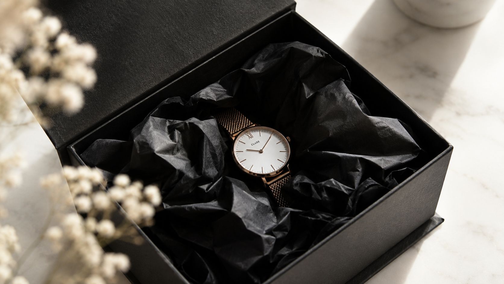
Black and deep navy create contrast and visual weight. They can make a small product feel carefully presented, especially inside a rigid box, but they also expose dust, fibres, and crushed edges more readily. Black tissue can be compelling for watches, jewellery, premium accessories, and evening gifting, although it can look excessive when every other packaging element is also dark.
Matching colour to the customer's context
A fashion label might use one restrained brand shade against a white or kraft outer box, allowing the tissue to become a recognisable dispatch signature. An independent bakery may get better results from cream, soft pink, sage, or warm yellow, provided the colour supports the food presentation rather than making the pack look synthetic. A gift retailer can layer a neutral base with a single seasonal accent, which creates variety without maintaining a separate colour system for every occasion.
The most useful test is not whether a colour looks attractive on a supplier's screen. It's whether it supports the product category under warehouse lighting, daylight, photography, and customer opening conditions.
What 2026 trends mean for colour selection
UK-facing packaging commentary for 2026 describes a move towards soft neutrals, warm creams, botanical greens, soft stone, warm beige, sage, and olive. The UK spring gifting trend commentary places these shades against brighter, overtly eco-coded treatments.
That shift gives muted colours a practical advantage. They can feel premium, contemporary, and environmentally considered without relying on metallic effects or intense pigment. Saturated navy, black, fuchsia, lime, and metallic finishes still have a role when a brand needs strong distinction, but they can undermine a natural or circular positioning if the rest of the pack promises simplicity and low impact.
A muted shade doesn't make a package sustainable by itself. It does make the sustainability story easier to communicate honestly when the material and local waste route support it.
Stock Colours Versus Custom Dyed Tissue
Stock colours are usually the sensible starting point for smaller or fast-moving brands. They're already manufactured, easier to sample, and generally available in a supplier's established range. That reduces the risk of committing to a shade before the fulfilment team has tested folding, tearing, visibility, and presentation.
Custom-dyed tissue makes more sense when colour recognition is central to the brand and order volumes justify the additional coordination. It can support closer Pantone matching and a more distinctive unboxing system, but custom work normally brings higher cost, larger minimum order quantities, longer lead times, and greater responsibility for proofing.
| Factor | Stock Colours | Custom Dyed |
|---|---|---|
| Shade choice | Limited to the established range | Greater control, including closer Pantone matching |
| Cost | Usually the more economical route | Higher production and setup costs are likely |
| Minimums | More accessible for smaller orders | Larger minimum runs are common |
| Lead time | Faster if the colour is held in stock | Longer due to dyeing, approval, and production |
| Consistency | Based on the supplier's existing specification | Requires approved samples and production controls |
| Flexibility | Good for seasonal testing | Better for a defined long-term identity |
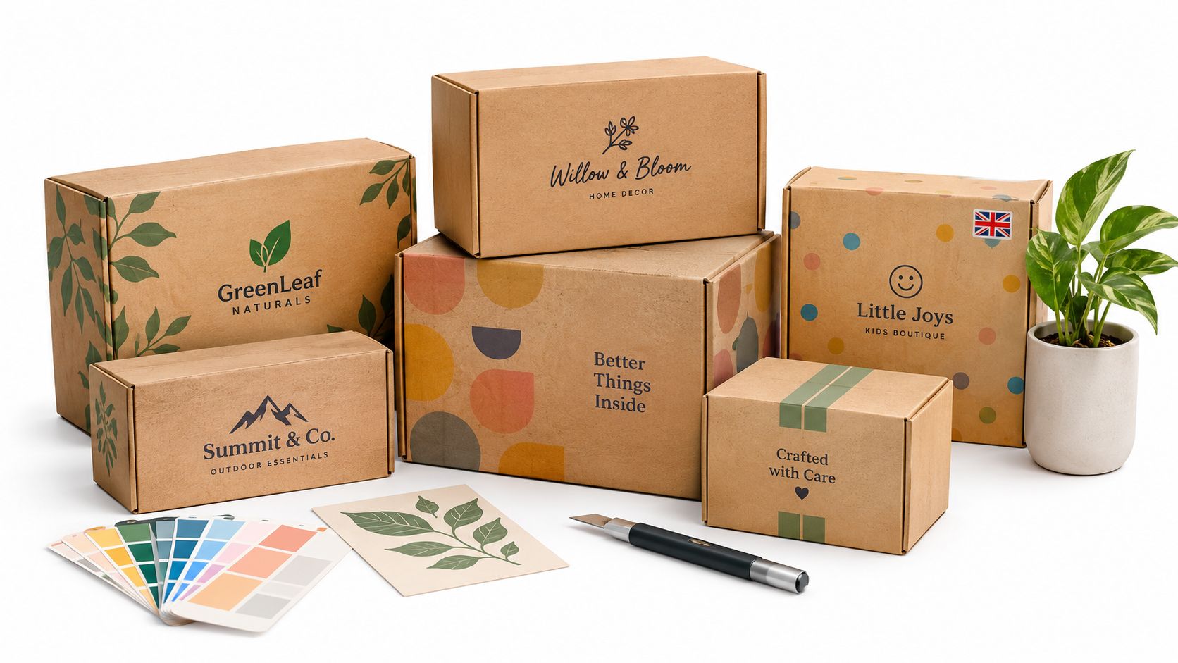
A supplier should provide physical samples rather than relying solely on digital colour references. Screen displays vary, and tissue changes appearance when folded, layered, or placed against kraft board. Samples should be checked beside the actual box, tape, label, mailer, and product.
When custom colour earns its keep
Custom dyeing is most defensible when the same shade will appear across several packaging components and the business has enough repeat demand to use the stock consistently. It's harder to justify for a small seasonal run, a product still being tested, or a range where packaging changes frequently.
The tissue paper range gives buyers a route to compare standard tissue options before deciding whether custom production is commercially sensible. A good procurement decision considers the cost of the paper, storage space, colour obsolescence, and the operational cost of running multiple packaging versions.
Recyclability and Sustainability Considerations
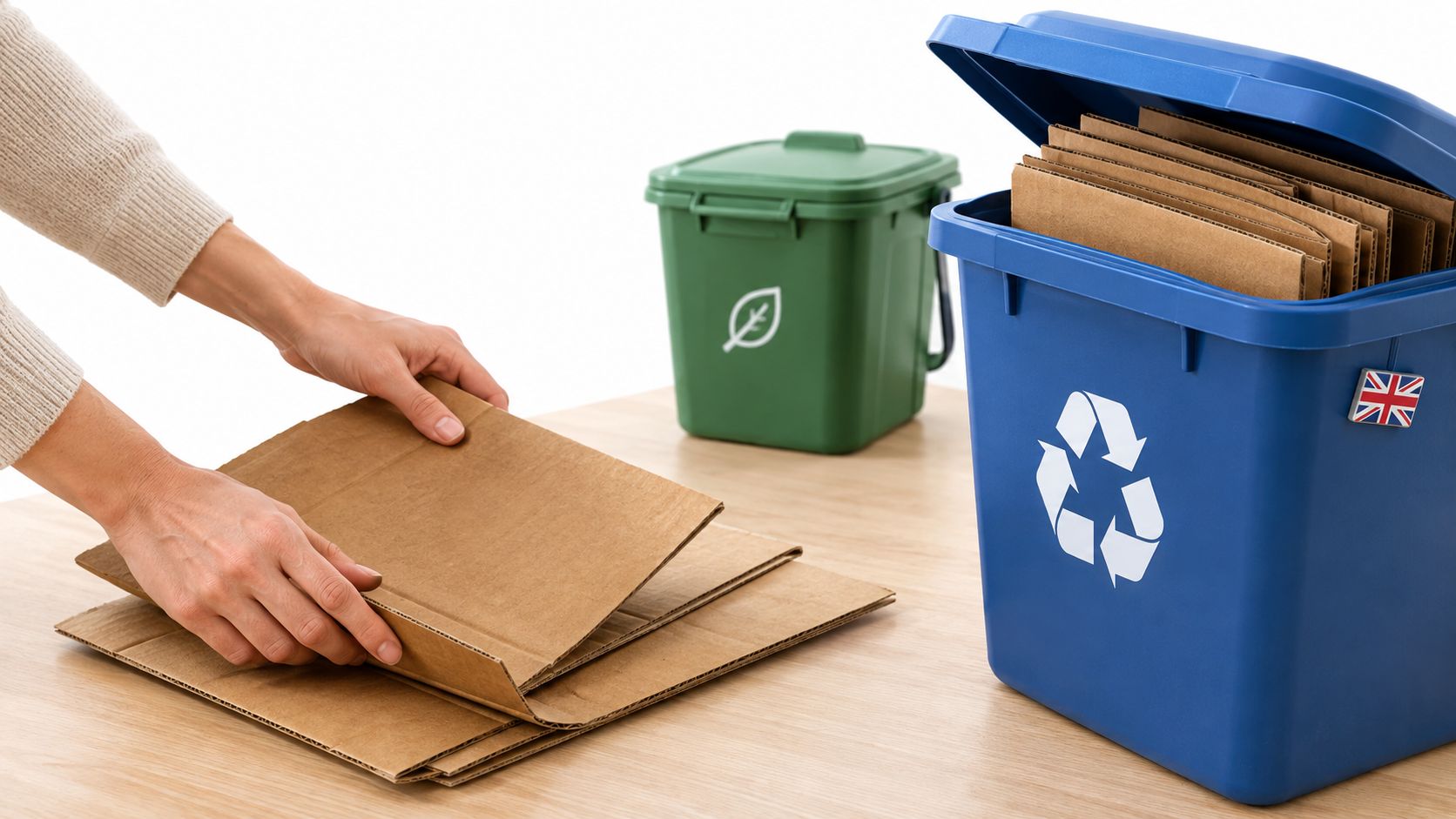
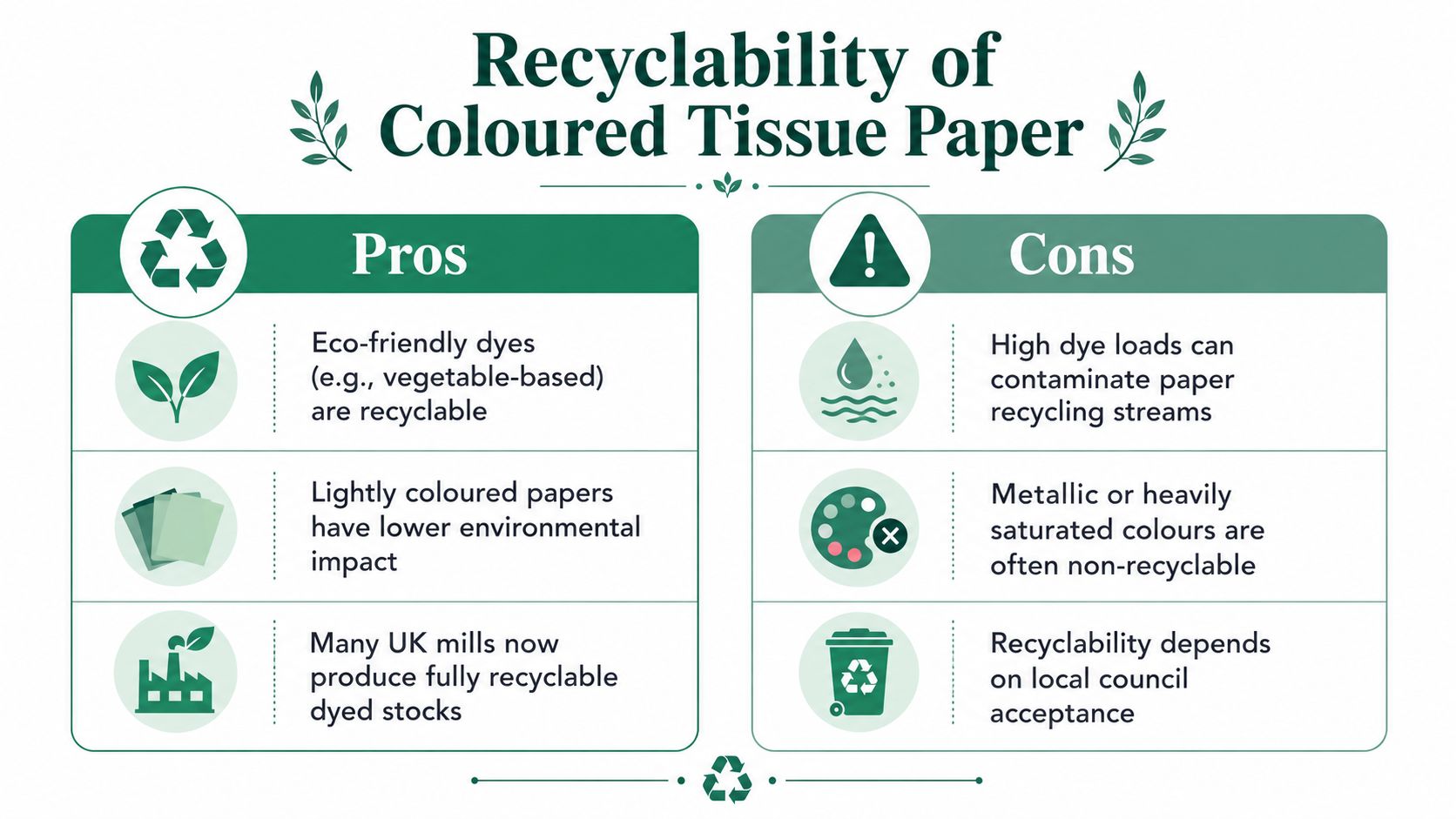
The honest answer to “is coloured tissue recyclable?” is it depends. Tissue fibres are already very short, and some UK local authorities exclude tissue paper from household recycling. North London Waste Authority, for example, directs residents to general waste because the fibres are too short for useful reprocessing. Its North London tissue paper guidance illustrates local policy rather than a universal UK rule.
Colour can create another processing issue. Paper mills use deinking, including flotation, to separate ink particles from pulp. Pigment, full-coverage printing, metallic effects, and heavy dye loads may make recovery more difficult. Lightly coloured or unprinted tissue is generally easier to present as a lower-impact option than dense, heavily printed stock, although the outcome depends on the paper construction and receiving mill.
A practical review before ordering
Start with the local route. Check the council or waste provider serving your customers, particularly if your packaging uses terms such as recyclable, circular, or kerbside recyclable. Collection rules vary by authority and material type, so a colour choice should not carry a broader claim than the available route supports.
Ask about the stock, not only the shade. Request details of dye or ink systems, coatings, metallic effects, recycled content, and relevant certification. A pale colour is not automatically recyclable, while a dark colour is not automatically unrecyclable. The finish and paper construction matter as much as the swatch.
Separate customer instructions from marketing. If a local authority sends tissue to general waste, the packaging insert should not suggest that every customer can put it in a paper recycling bin. Clear disposal wording is more credible than a broad environmental promise, and it supports a more accurate sustainable packaging approach.
UK paper-industry guidance recorded the recovery of 7.4 million tonnes of used paper in 2019, alongside an overall paper-and-board recycling rate of 68 per cent. The UK tissue colour and sustainability discussion highlights the difference between broad paper recovery and the specific treatment of tissue, dyed sheets, and coated products.
Brands reviewing wider material choices can use sustainable manufacturing for consumer goods to assess production decisions beyond the colour swatch. For 2026 packaging, muted tones often support a premium unboxing with less reliance on saturated dye, while bright colours can undermine sustainability messaging when recovery routes are unclear. White, ivory, kraft-brown, and lightly coloured tissue are usually easier to explain than saturated or metallic sheets.
Practical Use Cases Across UK Business Types
A colour that succeeds for a fashion parcel can fail inside a bakery box. Tissue needs to perform a job, and that job changes by product, outer pack, handling route, and customer expectation.
Fashion and apparel
A fashion brand wrapping a folded jumper or shirt often benefits from a calm base shade that keeps the garment visible when the customer opens the box. Ivory, soft stone, muted sage, or one consistent brand colour can create a neat reveal without competing with fabric colour. Acid-free tissue is relevant for products stored before dispatch, while the paper needs enough strength to wrap cleanly without splitting at folds.
Tissue isn't a substitute for an outer mailer or box that protects against moisture and compression. Apparel sellers comparing external options may find the guide to best poly mailers for apparel useful when deciding how tissue should work with the primary shipping layer.
Independent bakeries
Bakery packaging needs restraint and hygiene awareness. Cream, white, kraft-brown, or a gentle pastel can support a gift-box presentation, but tissue should not be allowed to touch food unless the material is specifically suitable for that purpose. For counter display and secondary wrapping, the colour should complement the cake board, box, ribbon, and printed label.
Warm cream often works better than brilliant white for a handmade bakery identity. Bright fuchsia or metallic tissue can be reserved for celebration ranges where the customer expects theatrical gifting rather than everyday presentation.
Marketplace sellers
Marketplace sellers often need flexible packaging across unrelated products. Neutral tissue, especially white, ivory, or kraft-brown, reduces the risk of a colour clashing with ceramics, books, accessories, or homeware. It can also simplify stock control because one shade serves several product categories.
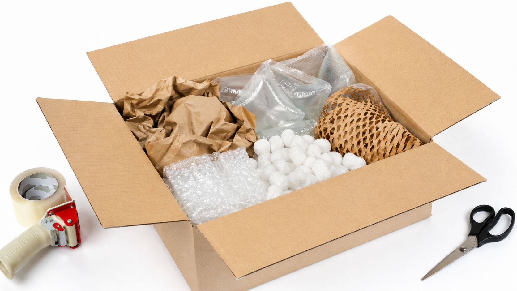
Tissue used as void fill shouldn't be expected to provide crush protection. It can stop surface scuffing and improve the opening experience, but fragile products still need a correctly sized box and a protective structure suited to the item.
Premium gift retailers
Gift retailers have more freedom to layer. A natural or ivory sheet beneath a single deep accent can create depth without flooding the package with pigment. A dark navy or black layer may make gold, cream, or pale products stand out, while sage and olive can support botanical or wellness-led ranges.
The strongest systems use colour deliberately. They don't add several bright sheets because the supplier offers them. One dependable base, one recognisable accent, and a clear end-of-life position usually outperform a large but inconsistent colour assortment.
Ordering Tips and Building Your Colour Strategy
A tissue strategy begins with the complete package, not the tissue catalogue. The chosen shade should sit comfortably beside the box, mailer, tape, label, product, and any printed message. It should also survive real handling, folding, storage, and the customer's disposal decision.
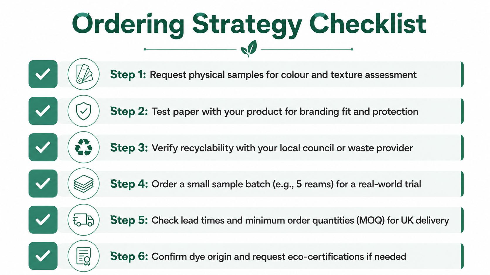
Use a short procurement sequence:
- Request physical samples for colour, opacity, texture, and finish.
- Test the sheets with the actual product and outer packaging.
- Confirm the local recycling or waste route before making environmental claims.
- Trial a small batch in ordinary fulfilment conditions.
- Check minimum order quantities, storage needs, and delivery timing.
- Record the approved shade and finish so future orders can be compared properly.
The minimum order quantity guidance is useful when weighing stock tissue against a custom-dyed run. A colour that looks economical per sheet can become expensive if it creates excess inventory, seasonal leftovers, or a second packing process.
The strongest choice balances three outcomes: recognisable presentation, suitable product protection, and an honest sustainability message. Muted tones often provide the best compromise for premium UK packaging, while saturated colours remain useful when distinction matters more than natural positioning and the end-of-life information is clear.
Packaging Panda supplies UK businesses with tissue and complementary paper packaging, including paper mailers, honeycomb bags, paper tape, kraft boxes, and tissue. Visit Packaging Panda to compare packaging options and choose a tissue paper colour that fits the product, presentation, and practical disposal route.